The Dashboard
Overview
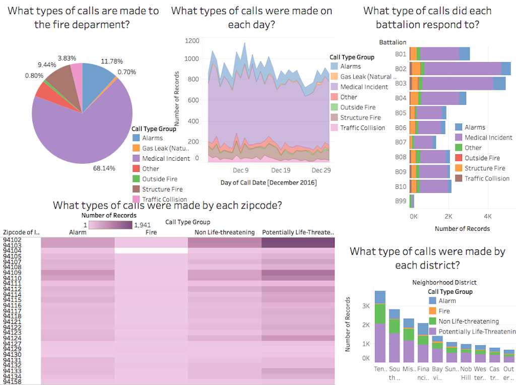
Our dashboard features five different visualization prototypes, each of which focuses on a different data subset and utilizes a unique visualization technique. Individually each prototype answers a specific question about the nature of calls to the San Francisco Fire Department, while they collectively provide insight into interesting trends that may have otherwise gone unnoticed. Each prototype incorporates call type, demonstrating how various attributes such as date, zip code, battalion, or district change the type of calls the fire department receives. Combined, the use of color across all five prototypes highlights the overwhelming trend of medical incidents as the call type, representing 68.14% of the total call volume as well as the most common call type responded to by each battalion, with the exception of B99.