Original Prototypes Dashboard
"The batch before we realized we had no idea what we were doing"
Data and Processing
Our data is a subset of a report released by SF OpenData called "Fire Department Calls for Service, December 2016" (link here). SF OpenData is a web service that provides data published by the city of San Francisco, with information on public services such as transportation, public safety, and city infrastructure.
The report deals with the SF Fire Department and includes information on every call response, including call number, call type, dispatch time, address, etc... Basically, lots of cool things. You should check it out for yourself sometime!
We decided to focus on only a subset of the data: medical incidents. Then, to trim down the amount of data in the dataset, we dropped several columns: Call_Number, Unit_ID, Incident_Number, Address, City, ALS_Unit, Location, and RowID. Finally, we added a new column, Response Time by Minute, using the derive transformation tool to get the difference between the Received Date Time and the On Scene Date Time.
About Our Prototypes
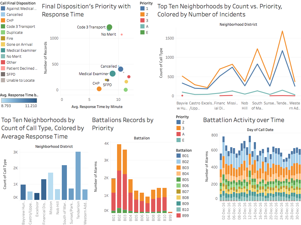
"I made a stacked bar chart and a regular bar chart. My stacked bar chart aims to compare the performances of the various battalions by looking at each one's total number of incidents per priority. From this chart, you can see that there are two main battalions, B02 and B03, that handle most medical alarms and probably are based around areas of higher incident activity. There is a battalion, B99, who's number does not follow the pattern and probably is a reserve unit of some kind.
My other bar chart aims to go more in depth to the different priorities by showing the relative frequency of each kind, while still showing amount by battalion. You can see that there are no priority 1 reports on the graph. Since our data only looks at medical typed reports, we can assume medical reports are not priority 1s."
-Joseph
"For the ScatterPriority visualization, we look into Final-Call-Disposition (The final outcome of the event) and its relationship with response time, priority, and number of records. I made a scatter plot to show this.
Observation: From this observation we see that high priority calls do not necessarily mean high response times. Looking at the right, situations with a higher response time tend to result in declined service or even no service at all. Our outlier, Code 2 Transport, tells us that an overwhelmingly amount of calls end with ambulance support to the nearest medical center."
-Vincent
"The two visualizations I created were a colored bar chart, and a heatmap. Both of my visualizations focused on a different aspect of the top ten districts by count type. The bar graph plots the district by count type. The coloring comes from the average response time by minute. The darker the color is, the higher the average response time. An interesting insight is that there doesn't really seem to be a correlation between how many incidents a district has and the average response time in that district. For example, Excelsior, the district with the lowest amount of incidents, has the highest average response time, while at the same time the Castro/Upper Market district has one of the lowest response times. Likewise, many other districts of similar sizes have varying response times.
The second visualization I created was a heatmap. Showing only the top ten districts by incident count, the heatmap plots the priority number versus district, colored by incident count. The darker the color, the higher the amount of incidents recorded in that district. An interesing insight is that by far, priorities 2 and 3 outnumber the others in count. The heatmap does not show priority 1 because in every district, there were no incidents categorized as priority 1. This is especially true for the Tenderloin district, where incidents of priority 2 and 3 number in the thousands more than those of priority A and E. What's also interesting is that even though the Tenderloin has the highest number of incidents, the number of incidents categorized as either A or E is roughly the same as all the other districts."