Tableau Prototype
Dashboard
Description
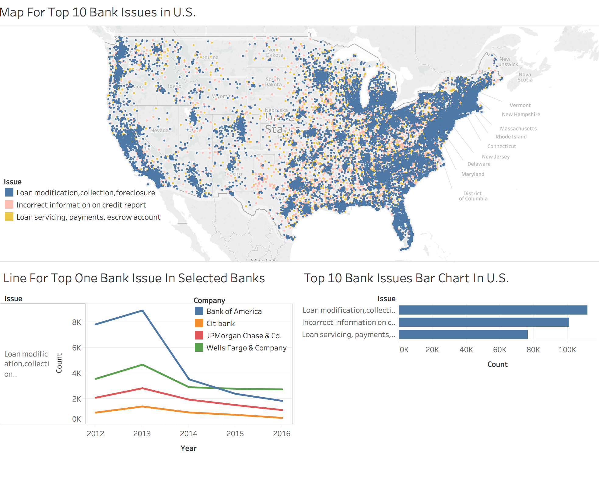
The dataset is really big, so I have to narrow it down to top five issues, in a descending order based on counts, and bar chart will show the total count of each issue. I will make interaction between these map and bar chart in D3. The map is based on longitude and latitude. The data points in map are really compact, so it is hard to tell a pattern or something useful, expcept the majority points scatter in western and eastern counties.
I am interested in knowing the pattern or story of the top one issue in the banks I like, so I simply make a line chart to get it start. The color shows details about company, and year is filter ranges from January 2012 to December 2016 to keep the completeness and accuracy of data, and avoid lie factor.