Visualizations
Click on a neighborhood to modify the visualizations.
Small Multiples Bar Graph
Multiline Chart
Heat Map
About the Data
In-depth overviews of each visualization.
Small Multiples Bar Graph
This visualization uses grouped bars to analyze the types of calls that are placed in these specific districts. The types of calls placed are categorized as “Alarms”, “Fire”, “Non Life-Threatening” and “Potentially Life-Threatening”. To distinguish the call types they each are given a different color in the visualization. The bar height measures the percentage of calls for that specific type were placed in the given district. Each district follows a similar trend where “Fire” calls occur the least, followed by “Non Life-Threatening”, “Alarm” and “Potentially Life-Threatening” in that order. The distinguishing district however is Presidio where “Fire” calls are placed the most. This is probably due to their dense tree population, that differs from the rest of San Francisco.
Multiline Chart
Using a subset from the San Francisco Fire Department Calls for Service data set, this prototype concentrates on the four flanking neighborhoods that surround the University of San Francisco (Haight Ashbury, Western Addition, Inner Richmond, Presidio) to include USF/Lone Mountain. The graph is a breakdown of the amount of service calls pertaining to "Potientially Life Threatening" and "Non-Life Threatening" events throughout the month of December 2016. Event activity is separated by neighborhood with the bottom of the y-axis representing no activity and the top representing the maximum activity. Likewise with the x-axis; left to right in a linear fashion.
Heat Map
Focusing on the the five districts around the University of San Francisco, this prototype highlights the average response time for calls to the SFFD. It calculates average this measure in minutes, subtracting the response time from the received time of each call. Also, the heat map plots these response hour per hour in an everage December day in 2016. Next, the heat map uses a diverging color sequence to encode data. Dark red colors signal slow response times. Light red colors clue quick response times. Overall, it seems that the slowest times occur around 4-6pm, perhaps because the most calls happen in the late afternoon and early evening.
Meet P3
3 Pinoys + D3 = P3
Michael Liston
Michael Liston is Bay Area native, living between San Mateo and San Francisco the majority of his life. After a small stint working for the computer publication PC Magazine, he enlisted in the United States Marine Corps. He currently majors in data science and plans to continue graduate studies at St. Mary's college in business analytics.
Lance Fernando
Lance Fernando is a junior majoring in Data Science with a concentration in computational analytics. When he is not diving deep into data or messing around on Kaggle, Lance enjoys playing music and cycling. After graduation, he hopes to get accepted into the Master of Science in Analytics program at USF to continue his studies in Data Science.
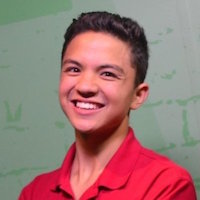
David Katz
David Katz is a junior computer science major and music minor at the University of San Francisco. In his spare time, he teaches people how to program in his online coding tutorials. One day, he hopes to start his own tech education company. Please reach out and connect with him. Visit his website to find more about his online courses, or click the icons below!
Contributions:
Michael created the Multiline chart and significantly refined the dataset. Lance created the Small Multiples Bar Graph, reduced key parts of the dataset, and created content for the website. Finally, David created the Heat Map and compiled the visualizations into this website.
