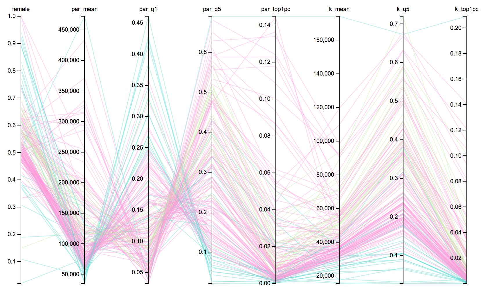
This visualization is based on colleges in California. The colleges are grouped by 3 major categories, Private colleges(including Stanford), Public, and NA. The NA category includes for profit schools, 2 year community college, and beauty/technician schools. Axes included in this graph are female count, parents average income, parents in the 1st and 5th quintile(bottom/top quintile), parents in the top most quintile. In addition, kids average income, kids in bottom quintile, and kids in the top most quintle are also displayed in this graph to compare/contrast with their parents income.
Drag along the axis to highlight specific lines.
Private
Public
NA
Some interesting insights I found through the graph are that students attending schools that belong to the NA category(2 year schools, beauty schools, technical schools) come from families in q1(the lowest quintile) and are also in the topq1 category after attending these schools. The population of female students in this category also seems to be the highest after all female schools in California(after Mills college and Scripps College). Additionally, female count in private schools also seems to be higher than public schools. We can also notice that parents in the 5th quintile(highest income) seem to be the ones with children in private schools while these same kids can be seen with low average income. Dragging along the y-axis for kids average income(from top to bottom) we can also notice that these high income colleges seem to also have a very low female count. From this we can conclude that mobility rates for students is not very high and going to a four year school is no longer the solution to the American Dream.
The Equality of Opportunity project is focused on documenting and questioning whether the American Dream is still possible. With this data, these economits documented the wide variation in economic mobility across the nation. The reseachers focused on four major results: access, outcomes, mobility rates, and trends.
Dataset used can be found here.