Data Visualization
CS Student
CS Student
Parallel Coordinates by Jay Ng. Inspired by Mike Bostock, Jason Davies, Syntagmatic and Alangrafu.
Edited code from https://bl.ocks.org/mbostock/1341021 and customized in D3 version 4.
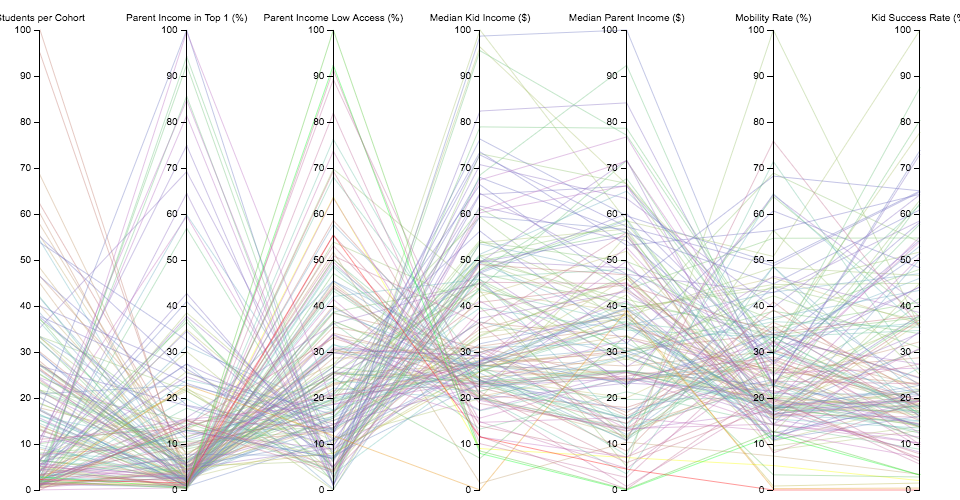
This data visualization is created by using the datasets from the "Mobility Report Cards: The Role of Colleges in Intergenerational Mobility" study by Chetty, Friedman, Saez, Turner, and Yagan (2017) at the Equality of Opportunity Project.
The D3 implementation of parallel coordinate in version 4 is really challenging. Most of the resources online is implemented in D3 v3 while the transition from v3 to v4 really took most of my time. For example, the previous d3.svg.brush function has replaced by three classes of brush for example. d3.brushX, d3.brushY, d3.brush. Besides that, rather than rely on the scale range to determine the brush area, in v4 you need to explicity determine the brushable area setting by brush.extent. Brush has also no longer to store the active brush position, the brush position is now access by calling d3.event.selection What I have learn from this stage is always look for the changelog documentation to know more about the details and changes before coding. There are some more challenges such as understandig how the event listener works and thinking about how to groups these data based on different categories and applied interactive features on it.
I decided to set the scale value of each y-axis categories within a range of 0 - 100 so that it looks consistent over all other y-axis scale's value. The formula of setting these scale value is new value = min + (max-min)/(largest-smallest) * (original value - smallest) where max = 100, min = 0, largest or smallest = largest or smallest value in original data based on that categories.
The Parallel Coordinates I implemented above shows that how's parent's incomes and reputation of Universities has some relation that affects the success of children. The Success Rate is encoded with diverging color that darker green represent higher chance of success and yellow zone represent 40 - 60% and the darker red represent the lowest of success rate from children.
I've tried my best to built some interactivity features that are able to show more details and hopefully provided the better visualization for everyone. There are a lot of challenges in building these features too and the two of the hardest one are the dragable y axis and the reset status of the graph. I will be listing out all the interactive features below so that you guys can click on the graph and play with it.
Lastly, I've tried to represent all the mean values of each categories in a Radar Chart. The implementation of the Radar Chart is quite hard for me that I need to understand clearly that how the axis is formed. Luckily, Alangrawu has built a great documentation on reusing his Radar Chart to create a new one which made me much more easier to do it.
Parallel Coordinate Prototype using Raw Graph.